Stick Figures
Week 1 This Module was about Visual Language, Visual Expression, Story Boarding, Character Design, Environmental Design, understanding of proportions and Sticky Figures drawing. Human's body, head size consists of roughly 8 times.
 |  |  |
|---|---|---|
 |  |  |
 |  |  |
 |  |
Environment of Child's Dream sequence in film


Nr. 3

My task was - to make an environment, that child would see in his dream.
First of all, I thought to check the images and ideas of what dream would a child could have. I saw everything, from the peach looking houses to huge ghost ships. But my eye was caught on the picture nr.3, then I thought that i want to make a castle.
Secondary, I started looking at the castle designs and designing my own. I tried to make a horizon line and a vanishing point to make a perspective look and then my drawing cubes i started designing castle bit by bit.

In the pic Nr. 5, You can see, how the castle looks just being drawn. After this, I though that it needs some colors to give an illusion how it should look like (spooky or maybe magical). One of the most important things for me were the sky. I love when the sky is beautiful, so I decided to take a reference picture (Nr. 8) and have an example of a nicely colorful sky. As well as i took a designs of moon and trees. (Pics Nr. 6,7 and 9).


Nr. 6

Nr. 8

Nr. 7

Nr. 9
That's my final work


And for the last, I tries to show a bit of a garden behind the castle, with loads of trees, stone stairs and a small wooden gate with some carving on them. This time, I gave myself a bit of a challenge and I did not get any examples. I tried to challenge my memory and imagination.
After the castle, I though that it would be a great idea to show, how it look a bit on the inside. This time I used just some crayons to give a mild color, since watercolor pencils that I used for a castle were not really my type.
Again, as well as for a castle i used an example pictures, to get some ideas.
And that is the final drawing:

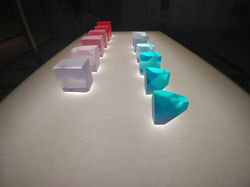
Exhibition ‘Breathing colour’

‘Breathing Colour is an installation-based exhibition that reveals the full potential of colour, and how colours breathe with light. Through a series and experiences, the exhibition makes us question colour, one of the most elements aspects of design.
My ultimate aim is to pit the power of colour against the power of form.’
(Hella Jongerius)
The exhibition, tells a ‘story’ of a colour change from the morning till the evening and how the colours beautifully change their shade - from the very lightest one, to a midnight black. But first, what is the colour and what is the light?
Definition in ‘Chambers School Dictionary’ says that ‘light is the brightness given by the sun, moon, lamps and etc, that, makes things visible’ and ‘colour is a quality that an object shows in the light. For example: blueness, redness.’
Basically, that the vividness, brightness, shade or tint of the colour depends on the light. Here is one of the examples:

As we can see, the top of this work is very light, due to bright light that illuminates the colours and shape of it, by blinding us and making hard to see the shape of the work. On the contrary, the bottom is a lot further from the light source, which makes it extremely different. We can clearly see the shape and colours of this artwork.
This exhibition is made into three main parts. Morning, Noon and Evening. Lets start with the Morning part.
Morning

‘Morning light first appears from the sun’s low position at the edge of the horizon. As the sun gradually rises, the warm shades of the dawn recede and the colder morning air creates a crystal-create glow with a blue-ish hue. The sharper morning light brings intense and crisp colours and the world feels fresh from the glimmering dew. Hazy, translucent shadows gradually become opaque shapes as room begin to glow and light pours in through windows and around curtains’ (Hella Jongerius)
Morning is a period of time between sunrise and noon. When the sun rises, and its rays reaches the earth through the atmosphere, it gains a blue calming colour, followed by red and yellow hue. The artist though her work tries to show the shades and colours that morning gives. It feels warm, light, relaxing. Colours are mostly pastel and nice to eye. Shadows becomes less visible and the contrast between the colours is modest, feels like energy overflows.
Noon


‘As the sky reaches its highest point in the sky, daylight is at its most intense. The powerful light from above produces strong shadows and stark contrasts, creating lively exchange with the energetic colours of noon. The light embraces objects, making them fully defined. The intense light brings pigments and brightly saturated colours to life. Colours look greener and red tones are reflected in many ways.’ (Hella Jongerius)
As the Author says, the colours the Noon becomes more intense, darker. Shadows are more visible and darker. Since the sun has to pass though more atmosphere, the blue scatters away and the more it goes to the sunset the redder it gets.
Evening
‘In the evening when the light is filled with air pollution, more black starts to mix into the hues, and colours become flatter. Although there is similarity between the warm tones or dawn and dusk, evening light has a unique quality. It brings a sense of colour gradually disappearing, becoming consumed by the darkness as the shadows takes over.’ (Hella Jongerius)


At the Evening, more and more, black colour and shadows invades, by creating incredibly beautiful ornaments, silhouettes. Generally, evening resembles loneliness, monotony and sadness. It gives cold felling, vagueness, what is going to happens. As well, during the Evening time, people thinks a lot about their lives, looking for the meaning or answers. It is a very subtle time, when we get more courage to fight against the troubles. With this, the Author shows, how creative light could be, by leaving beautifully deployed shadows and blue, black and grey colour tones.
Other exhibition artworks:
 |  |  |
|---|---|---|
 |  |  |
 |  |  |
 |  |  |
 |  |  |
 |  |  |
 |  |  |
 |

Colour wheel
‘The experimental colour wheel was developed to explore variations in tone and hue resulting from incremental changes in colour mixtures. Each of paper discs contain a tab in the centre showing the original pigments – or ingredients – that have been combined to produce the final colour.’
(Hella Jongerius)
This is an excellent example, how the colour pigments are created. It is a very useful artwork, for inspiration to get a beautiful colour tone.
Library task
1. Find a Designer
2. Write 100 words about it
3. 2 drawings
Character Designers: Inspiration
 IMG_20170114_222025_931-58a01296a1b60__880 |  d1d19b97a2de2c96d4a52bc44e7e9108 |
|---|---|
 89e231b46c9ce98f091e0d1525834716--timeline-photos-stretched-canvas |  19274928_10155594376358109_2147353221095085292_n |
 4d043ce81bfeb456536cb75c103db5bf--art-café-panda-art |  3ec638d96fdff2c1a7d83cdb833d1216 |
Ali Shimhaq - is one of the digital artists that I adore. His technique uses a variety of blended colours mixed into a painting. We could see, that most of his digital paintings uses black, blue and red, yellow colours, to make a contrast between the colour and getting an incredibly beautiful and emotional painting. He mostly paints animals and fantastical creatures in an expressive posture.
By this colour blend, the artist made get even more amazed the colour variety and combination via digital art. One of my goals became to understand digital techniques of painting and realise my ideas in the digital world.
The library task look perfect for me to get inspired about my character design, so I decided to look more into a human proportions. Is is always easier to see the actual drawing, lines and 'shadings', even if it does not look that realistic, but I believe that is a fundamental factor to understand, how the pencil or material that I would be using works. By drawing- improve and instead of those animated eyes, make look like an actually realistic ones.
On the library task, I decided to draw two characters, man and women. Even through, it does not look real, but the time was limited, so I believe, that researching and understanding every part of human body takes a huge amount of time and effort. That is why I was focusing to show a general idea of what I would be looking at. In the end my drawing looked like that:
 |  |
|---|---|
 |  |
 |  |
 |


These experimental characters has a Hero and a Villain roles. This time I decided to make Villain a girl. To make her look fiercer, I made her face sharper and eyes half open, to show her coldness in the face.
Nowadays, cyborgs are very actual, it gives a feeling of fear, that computer is more intelligent that a human being and that idea looked incredibly good for me, since my characters for project must have some story line as well. Not necessarily said, but shown in the outlook. On the other hand, my Hero is a guy. Martial art-wizard. I tried to make him look more calm and aware of the situations. Even if these drawing are definitely not good ones, but I believe, that experience that I got about understanding the proportions is critical.
Photo Collages
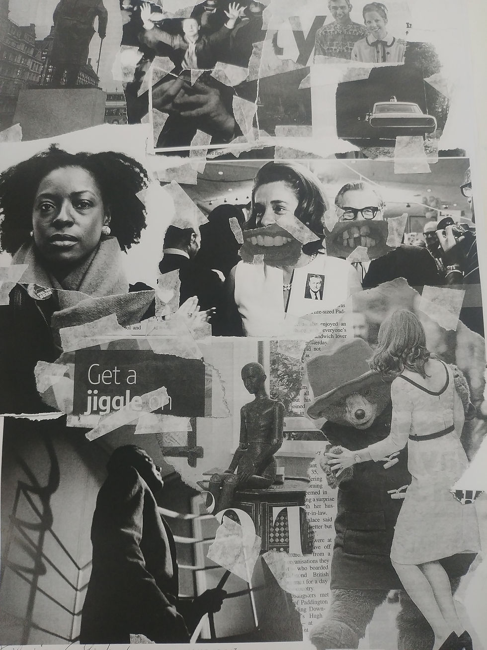


In this lesson, we were making photo collages from various journals, magazines, newspaper. The main focus was to think of a composition, rule of thirds and learn about the camera angles.
Extreme Long Shot
Long Shot
Medium shot
Close-up shot
Extreme close-up shot
Eye level
High angle shot
Low angle shot
Eye level shot
Over-the-Shoulder shot
Bird's-Eye View
Tilt shot
We were making collages and then elected the best shots based on our knowledge and creation. Cutting them out and making a series of camera shots by getting unexpected results and understanding, that camera shots has a huge impact in the composition.
To make it more valuable and interesting, we were taking those shots and redrawing them on the sheet of paper, while changing some details. This technique is incredibly good to use, when a good composition is needed.

 |  |
|---|---|
 |  |
 |  |
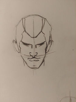
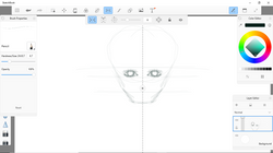
Trying human head angles
In order to understand human body better, I draw some human heads and how they change when we see it from different position. Some of these drawing has my first touch to Wacom tablet.
Even if these drawing are not successful, but I believe, that only by practising, I could achieve better results.
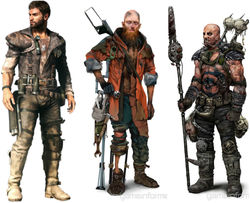
Character design


For my project, I got to do two characters - Hero and Villain- based on the movie called 'Mad Max'. First of all, I decided to analyse how the characters looks in the movie. They looked creepy, with dirty looking clothes. Reminding of survivors of the fierce battles. I took some clothes examples, to inspire myself and start already thinking, how my character could look like. As well as I started looking onto the head proportions.
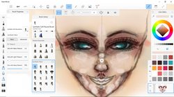
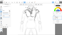
My First Try with Wacom Tablet
I was incredibly inspired by a designer Ali Shimhaq (mentioned above), that I decided to give a try for digital art. And, I got highly interested. In my way of opinion, it has so many pros, like variety of brushes, colour blend. It looks a lot easier to look for proportions on the screen that is right in front instead of the paper on the table.
This as my first proper try, exploring the brushes, colours, layers. I was not looking at the proportions or shadings. I was using Autodesk Sketchbook, which is easy to understand and has a great effect of the brushes.
 |  |
|---|---|
 |  |
 |  |
 |  |
 |  |
 |  |
 |  |
 |  |
 |  |
|---|---|
 |  |
 |  |
 |  |
 |  |
 |
 |  |
|---|---|
 |  |
 |  |
 |  |
 |  |
 |
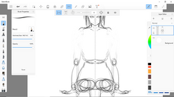
On this digital drawing, I decided to give a try and make my characters head. Ir does not necessarily mean that it will look like this, but this is just try. My goal was to make a women's head mostly out of my imaginations. Looking into the shadowing, avoiding black lines, that makes the drawing look animated. I was trying to make it look as realistic as I could achieve. Of course, eyes looks too big, skin colour not right, but I am quite happy about the result that I got.
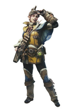
For my character designs, I made some mood boards. I tried to look up human proportions. Since this is a fundamental for creating the character.
In the creating process, I was gathering all kind of references. Whenever I feel that I need to look up to something - I search on the internet.
For man male character - I was using my friends face, so I asked him to take several pictures of his face, from different angles and pictures of his body structure as well.
I decided that my characters are going to be made with Sketchbook Pro using Wacom tablet.
In the process of drawing, I was creating many layers and experimenting with them. By lowering the opacity of a particular layer, I was getting different results, by turning off some of them everything looked different again. It helped my to create face shapes without using any harsh colours, keep the form and structure.
As well, by using this method, I was exploring brushes and colours, even if I still can not use them properly, but I feel that I made a progress
 |  |
|---|---|
 |  |
 |  |
 |  |
 |  |
 |  |
 |  |
 |  |
 |  |
 |  |
 |  |
 |

These are my final characters. I am quite happy with my male character, which took my quite a lot of time, but I believe that I improved working with Sketchbook Pro even more as well as using Wacom tablet.
My male character was based on the persons that I know appearance, so it was not too hard to get the reference images. The female character took me less time, but it did not went out the way I wanted.
Legs looks too blurred, texture does not seem to be well and eyes looks too big for her face, but the result is that, I was using similar technique as with my male character and it took less time.


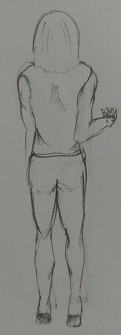
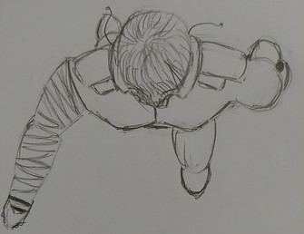
These drawing shows different angles of my characters. And each has a fighting stand, to show the personality. Because the way that people stands and moves, could tell something about them, we can feel the atmosphere. I done these drawings by pencil on plain paper.
So, the Male Hero, is a robust and strong look. Tried to make him look serious and slightly scary even if his personality is really good.
On the other hand, my female enemy looks quite normal, to hide her real feelings and her temper. She uses the knife when fighting and is very skilled in martial arts.
On the pictures below, I was experimenting with a different colour background. By mixing different colours, I wanted to make a contrast between character and the background.
In the end, the main purpose was to get a little bit closer to Ali's Shimhaq paintings and understand a little bit of technique and brushes that he uses.


